Rasera - Corretora de Seguros
Projeto de identidade visual desenvolvido para Rasera Corretora de Seguros.

Rasera is an Insurance Broker which, although new to the market, already has a wide range of customers from the previous owners’ business. It’s a traditional company that values the reliability of services offered.
Conceito/Concept
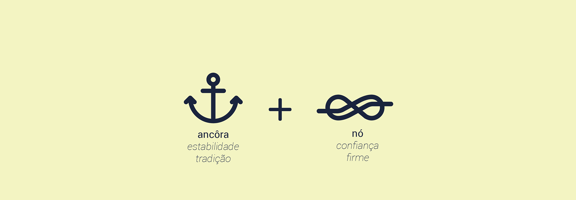
The anchor refer to estability and tradition, while the knot refers to trust and strong bonds.
Tipografia/Typography

Paleta de Cores/Color Palette

The colours chosen were a navy blue and a pale yellow, which complement each other and creates great constrast, while both are related to the concept we developed.
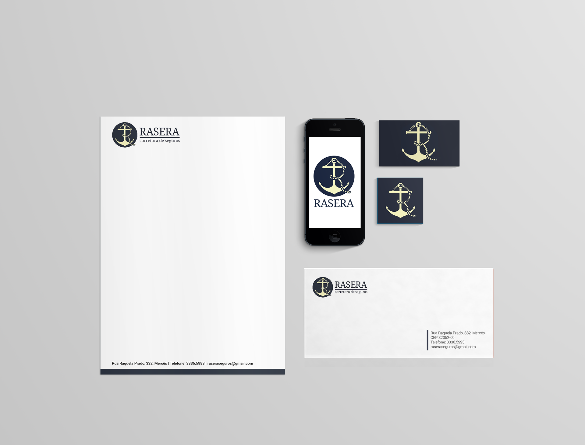
Resultado Final/Final Result

Projeto de identidade visual desenvolvido na Júnior Design para Rasera Corretora de Seguros.
Equipe Jana Falkiewicz, Gabriela Ianegitz e Yanne Moreira.
Orientadora Amanda Fortes
Anchor and Knot icons by Guilherme Zamarioli